40 Great Nail Ideas -- Teal


It's time for another challenge with The New Crumpets Nail Tarts.  The challenge today was teal and then as we've got different designs to go along with the challenge, my extra challenge was to do a gradient.  I'm in the process of moving houses so all my nail supplies aren't readily available and, unfortunately, one of those things was a proper nail sponge.  However I felt this gradient still came out quite unique.  I did a lighter color and then popped some glitter over the top!  It sort of reminds me of a wave in the ocean.  :)  I hope you like these!  Until next week!! :)


Sparkles and stripes...


This is another remnant of my vault cleanout!  I think ultimately after I had this one on my computer I just didn't think it was clean enough or that it photographed well enough to make it on the blog.  That being said I really loved this mani too and I wore it for a considerable period of time. I started out with just wanting to do the stripes and then I decided later to jazz it up a bit with some glitter. I hope you enjoy it!! :)

When it rains, it pours...


So today's brand post is both inside AND outside the box. The design of it is quite straightforward but then it's not really very obvious to anyone looking what the brand is.  Have you guessed it yet? 


It's for Morton Sea Salt!  I had the container on my counter and thought the design was really pretty. It ended up being a great week to unveil it!!  Even though the brand logo is the little girl with the umbrella, all the Morton  brand salt products include the navy so I think it still works! ;) Check out what the other ladies came up with below! (And please excuse my photography on this one. My camera went ten shades of crazy for some reason!)

Catching neutral fire...


 So today's look is sort of Hunger Games inspired!! Last year I did a whole series of art for the film and while I'd love to do it again, let's face it, there just really isn't enough to pull from in the second book to create twelve designs. I wanted to do at least one Hunger Games inspired mani for the release of Catching Fire but I just didn't feel inspired. These nails aren't really inspired by the book either, although one could argue that they sort of look like a neutral colored fire! 
 

Instead they're inspired by a dress worn by actress Elizabeth Banks to the premiere of the film!  I really love the dress she wore, the gradient of nuetral colors with a flash of sparkly silver! I added some texture to it to sort of emulate the beading as well. It came out almost exactly as I wanted it to AND it was one of the easiest mani's I've ever done!! 
 

Gorgeous, no?

Tribal Gradient


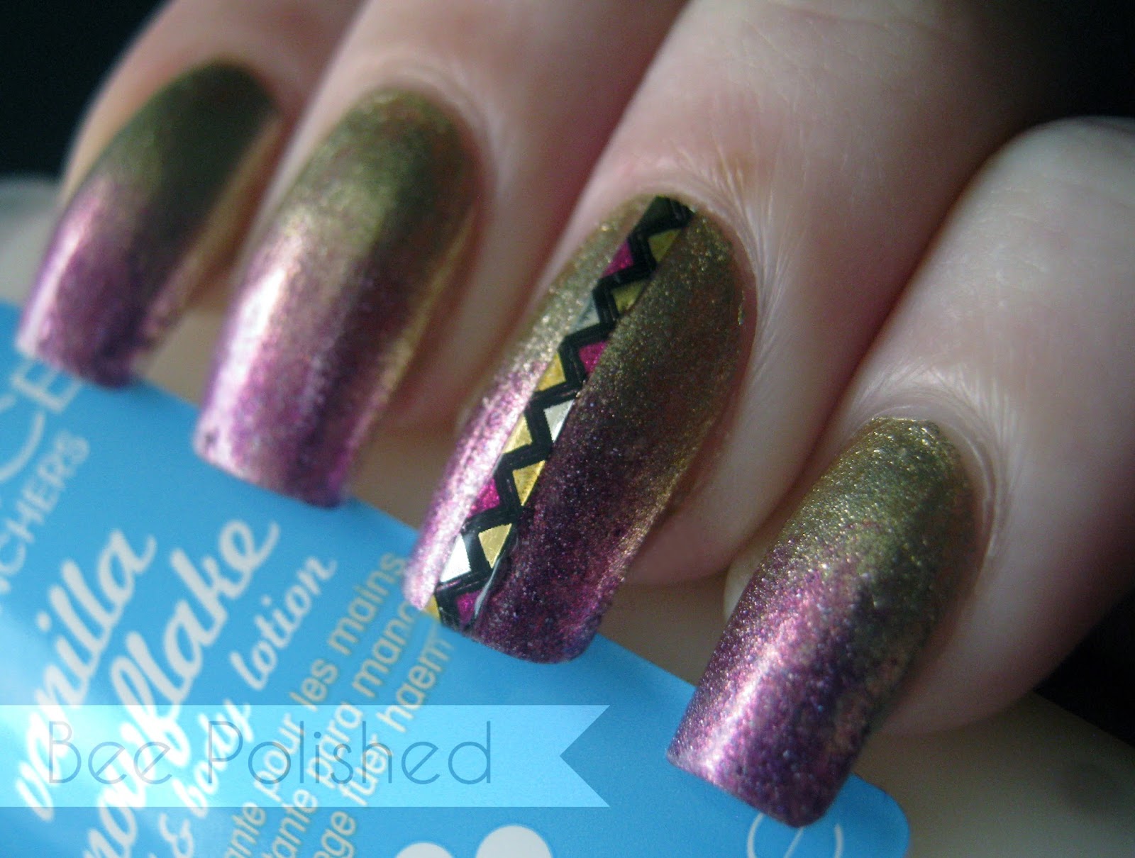
Well this is a manicure born out of boredom and also a little bit of frustration.  I have these  Minx Nail Strips which I keep meaning to use in some way.  The strips are gorgeous and have a mirror like effect on the background BUT...my hairdryer has been broken for ages and I just can't seem to get them warm enough to sit nicely on my nail without it.  So instead I decided to cut the design into pieces and use them individually in different art.  So here we have a simple gradient which I've fancied up a bit a few days in with a tribal sort of strip!  I hope you enjoy it! :)  Thanks for following!


Colors Used:
Orly Luxe and 
Zoya Aurora

Buried Chocolate...


The sun is finally out again!! It's been dreary and rainy here for some time now and while we definitely needed some rain and cooler weather, it wasn't so great for my nail blogging pics!  So the sun is out and it was a perfect opportunity for me to give this little gem a go on my nails.  The base on this is Orly Buried Alive.  It's just an absolutely stunning polish as you can see!  It has a deep mahogany jelly base which is just crammed with coppery shimmer.  Gorgeous.  Since I have another 'brown' glitter in my collection I thought I'd marry the two and see what came of it.  I think it came out rather lovely myself.  The tips (and base on my accent nail) are Lynderella Choco-latta Love.  It has colored glitter as well as smaller brownish glitter in it and mostly the color is what shows on these nails.  The only flaw with the Lynn is that it's very chunky and I found the clear base to be very thick and difficult to work with.  I don't know if thinner would have helped any as I didn't try it but the effect is still quite nice on the nails!  I hope you're all having a wonderful weekend!!

Red, White and Barry M


These are going up a BIT late but what can I say, I had a busy holiday!!  For those of you who don't live in the US, yesterday was the Fourth of July. The day we all get drunk, cook out, and light off fireworks.  Great combination, no?  It's a celebration of our nations independence and this year, for the first time in eleven years, I was off work.  I had SO much fun celebrating with my family despite the fact that it was close to 100 degrees outside. Redic. I wanted to do some red, white and blue nails for the occasion but then I spotted  some glitters and my original plan went out the window.  Ironically, these are all British polishes by BarryM.  But hey, it looked great anyway!!  I used BarryM Silver Foil as my base and then used a sponge to add Silver, Red and Blue Glitter.  They sparkled SO much.  And my niece loved them so much she asked for me to put them on her nails too!!  Matching BarryManicures. :)


I hope all my US followers had a wonderful holiday!!

Muppets Metallic


Awhile back I picked up a few of the Muppets collection by OPI.  When I first got them the only two colors I was interested in were Warm and Fozzie and Rainbow Connection.  Then I kept seeing swatches for Designer di Better and decided that it was also a MUST HAVE.  And now I have almost all of them. Go figure.  Long story short when I got the Designer di Better I noticed that it's essentially the same as Warm and Fozzie, but it's sort of the opposite.  The Warm and Fozzie is a warm bronze with tiny gold, silver, and various colored flecks while the Designer di Better is a silvery based polish with tiny bronze flecks.  So I thought it might be cool to do a gradient with the Warm and Fozzie at the bottom.  The Designer di Better has the little coppery flecks that sort of draw the whole thing together.  This is what it ended up looking like.  I actually liked it a lot although the bronze on the base didn't stick out as much as I thought it would.  The only issue I had was removal. That Designer di Better is a nightmare to get back off!! But so worth it for this understated yet blingy mani!!
Enjoy and thanks for following!

Warm & Fozzie sponged over Designer di Better

Popular Posts

Like us on Facebook

Flickr Images