Swatch This! Color Club Worth the Risque


Today I have a swatch post for you!  It's so cold and dreary right now and there's just something about a holographic polish that makes everything feel better!  This is Color Club Worth The Risque.  As silver holo's go, it's pretty decent. Not the strongest holo effect but it's definitely there and it's not as finicky as other colors so you don't need a fancy aqua base coat or a specific stroke to get it to look magical.  I've stamped with this one before with mixed results.  Normally I'd dress it up a bit with some art but today I just really needed a rainbow. ;P  Do you have this one?

Forty Great Nail Art Ideas: Three shades of purple


Today I have another design from the New Crumpets Nail Tarts challenge.  The challenge today was to use three shades of purple.  Unfortunately, after I finished my design it occurred to me that this week we have a double prompt and I reluctantly went to see what I had missed.  My secondary prompt was mosaic so I decided to top off my original design with a funky mosaic-like stamp and actually, I quite love this one.  I'm not super into purples but I used some sort of pink-fuschia type purples which I feel look a little better with my skin tone.  Then I decided to ramp up the fun by recreating this design in one of my MOST favorite colors on my other hand.


So here's my right one....


...and my left!  This was so much fun to do! I may do something similar again in some different colors.  Which way do you prefer it?


 Check out the other girls art below!!


Autumn Leaves are Falling...


 I'm finally getting around to cleaning out my cache and this is another look that was originally intended for Digital Dozen week but it was just....failed.  Well not really failed so much as not well executed.  I've always been a writer and nearly always I'll write something and then edit it into oblivion. It's gotten to the point where I only allow myself three read through's and then I leave it to go because there's never going to be a time when I love it completely.  I guess I'm the same with these designs. I nearly always have a run through or two before I get to where I really want to be. Well let's face it even the final results are rarely what I wanted to end up with but usually they're much better than the first one!  This one I felt the leaves didn't stand out enough and I didn't like the way the glitter polish left streaks.  I ended up redoing it with white nails (my fave!) and just the accent as whole design. Do you ever do run throughs? How many times to you allow yourself a redo before you accept the results?

...every paper girl needs at least one string, right?


This design was sort of a failed it manicure. It was originally intended for the week of New and Improved with the Digital Dozen but...this was a HOT.MESS.  It came out looking sort of like colored hot dogs and that's the lamest. So definitely not improved!! This technique...well I'm not even sure what it's called really. It's the one where you pull strings of polish across your nails to create a really cool textured look.  I failed it. Hard core. I tried a few different methods and watched some videos and I don't know if I'm not patient enough or I used the wrong polishes or what but it just never ever worked for me.  So I'll keep trying and hopefully pretty soon I'll have a really epic one!  For now...well...you can't always be good at things on the first try, right?


Forty Great Nail Art Ideas: Things that Fly


It's the final day of New and Improved with The Digital Dozen! It's also time for another challenge with The New Crumpets Nail Tarts. As you can see from my title the challenge for that was Things that Fly. SO...today I have combined those two challenges, hopefully successfully! :P  For my new and improved I did a new to me technique which was alcohol and markers. I found that quite interesting. First...I love it because it's totally easy and it's 100% fool proof.  If it's too light you can just color on more ink. If it's too dark you can water it out more. You can smudge and smear and spread it for as long as you like and it almost always looks like a work of art. I also found it so odd because when I top coated it, ALL of the pink disappeared. So for a little while there I was like....OK now it's just a blue manicure.  But then it all came back so I have no idea what happened there but panic attack averted!  Then I did these little birds on top. I wanted them to be a little worn looking and not to cover the whole nail. Just to give the whole thing an overall distressed effect.  I think this was my favorite of the week!  Check out everyone else's art below! Thanks for joining us for another Digital Dozen week!!


People are like stained-glass windows...


...they sparkle and shine when the sun is out, but when the darkness sets in, their true beauty is revealed only if there is a light from within. 

Today I decided to do a lead lighting technique. I recently acquired a few of the OPI sheer tints and even though I already have a whole set of the sheer Essie colors, I got sort of inspired to try to do this again.  I'm not super sure how much I've improved on it as this is only my second go round and they could certainly use some work still but I think overall they came out rather nicely.  I definitely want to play with this more in the future but I find myself short on stamps which would accommodate it so that's going to be obstacle number one! :P Check out the other girls art below!!


Splish Splash...


Moving along on the Digital Dozen challenge today I have another technique that I've never really tried before.  Well, I've tried it but never successfully executed it. This is a splatter mani.  Generally achieved by holding your nails over something you don't mind ruining and then tossing thinned polish at it.  I've never been able to do it without a heavy coat and I dont like it to be raised. I lost patience waiting for it to dry too so it ran a little and it smudged when I top coated. Oh well though. Still looks decent! Check out the other girls art below!


A rose by any other name would smell as sweet...


Today I have a pretty simple design for you.  I was experimenting with making decals using my sheer polishes.  I actually really LOVE this decal but I felt it was too large to look nice on every nail.  Then I started looking for smaller designs that would compliment it and the more I looked the more I really loved the start contrast of the blank nails beside it.  It's sort of like having a really large canvas and just putting a nice, large design in on one part of it.  It really makes it stand out. I don't think art always has to be busy.  It can definitely be just simple and classic.  Plus there is something about plain white nails that I can't get enough of!! Anyway check out the other girls art below!


The Digital Dozen DOES...New and Improved!


Today is a bit of a double dose for you all!!  Firstly, it's Digital Dozen week again.  This year we have some really awesome things coming up and we have some fresh new faces so don't forget to check out the links and admire all the new girls amazing talents! This month our theme is "New and Improved" and we're doing things that we haven't tried before OR that we've improved on.  At the moment I'm still fussing with when and where to take my photos in the new house so my lighting skillz will hopefully be new and IMPROVED next month! For now I offer my sincere apologies.  I've done a needle marble today and while it's not incredibly improved it does seem a bit more put together than previous ones I've tried. It obviously needs more work.  Today is also a music Monday and this technique was a great way to capture the art work of the band I'm currently spinning...

  
They're called The Sweeplings and they're sort of a folky pop group. If you like The Civil Wars (which I do!!) they're probably right up your alley! I hope you enjoy the art and again, you can check out the other girls art by clicking the link below!!


Forty Great Nail Art Ideas: Pale Blue Base


It's Friday! That means it's time for another design with The New Crumpets Nail Tarts! My challenge today was a pale blue base with scales or mermaid scales. I unfortunately have no plates with mermaid scales, something I must rectify soon!  However, I did have this fun plate which looks kind of scaley.  I used Butter London Kip for my pale blue base and then I sponged on some glitter and a darker blue for some interest.  Then I stamped the dark teal on for my scales. Looks pretty groovy! :P  Check out the other girls art below! 

Zoya Whispers Transistional Collection for 2016


 Today I have the Zoya Whispers Transitional Collection! This is a a six-piece transitional collection featuring soft neutrals and light shades.  I found the colors to be very muted and sort of grey toned but I really loved them!  I'm a big sucker for grey tones and soft colors and these really hit the spot. They aren't pastel so they're perfect for this time of year when you're switching over from darker fall and holiday tones. They're all also incredibly work appropriate which makes them a dream for those with office jobs like myself! I did find these all to be thinner than most Zoya shades so I've done three coats on them for even coverage. So onto the colors!


Ireland by Zoya can be best described as a uniquely wearable green that is muted enough to make it subtle yet still interesting. This green is well balanced between blue and yellow so it's flattering on all skin tones.


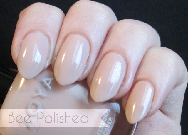
Cala by Zoya can be best described as a soft nude with a kiss of warmth that will flatter most skin tones.


April by Zoya can be best described as a light, rosy toned neutral that is a modern take on blush. April turned out to be one of my favorite colors. She's a PERFECT match for my skin tone and she's sheer enough to use as a one coat french color or layer up for nude coverage.


Eastyn by Zoya can be best described as a subtle grayed grape that is more interesting than mauve and gives a modern alternative that is ever so wearable. I found this one to be more of a griege tone than a grape but still very pretty!


Misty by Zoya can be best described as an easy to wear taupe that is an updated version of gray with just a touch of green to make it daring.  


Lake by Zoya can be best described as a softened blue that gives the effect of serene water with just a hint of vibrancy to preserve its luminosity.I really struggled with capturing the true color of this one. It's much bluer than the photo shows but it's also quite grey-ish like the rest of the collection.  I've used this one in some art that's upcoming so hopefully you'll get a better idea from that one!  These colors are available to order on the Zoya website AND right now they have an amazing deal that nets you FOUR polishes for FREE (you pay shipping) with code 4YOU!  Which shades will you be snagging?

**These colors were provided to me for my honest review. I have not been compensated for my opinion. Shade descriptions are taken from Zoya.com**

And I've been a little too nice, I know...


Happy new year everyone! This year I'm trying to get re-inspired with my nail art.  I used to see things all the time -- patterns and albums and just all sorts of things -- and think; that would make awesome nail art!  I never got around to doing loads of them and others just seemed to be well above my talent level.  So this year I want to try to get back into using more abstract things as inspiration.  For the month of January, and possibly in the future I'm going to do some art based on what I'm listening to that week.  Or rather, I suppose it will be based on what I'm listening to the week before!  So this week has been a very Priscilla Ahn type week.  I love her music because it's relaxing and gentle and her voice is very soothing.  It's great for days when you need a pick me up or days when you're feeling introspective.  The album art I've featured here is from her self titled EP.  I picked it up many years ago at an Anna Nalick concert with Joshua Radin where she was a featured singer. I've been in love with her music ever since. 


I accidentally reversed the face part but I feel pretty good about it since I'm terrible at doing art with people!! I hope you all enjoy these! Please check out Priscilla if you haven't already! If you do let me know what you think! :)

Popular Posts

Like us on Facebook

Flickr Images